
Student Work
Element / Principle / Emotion
Design Concepts, DES 101
Syracuse University
![Element / Principle / Emotion]()
![]()


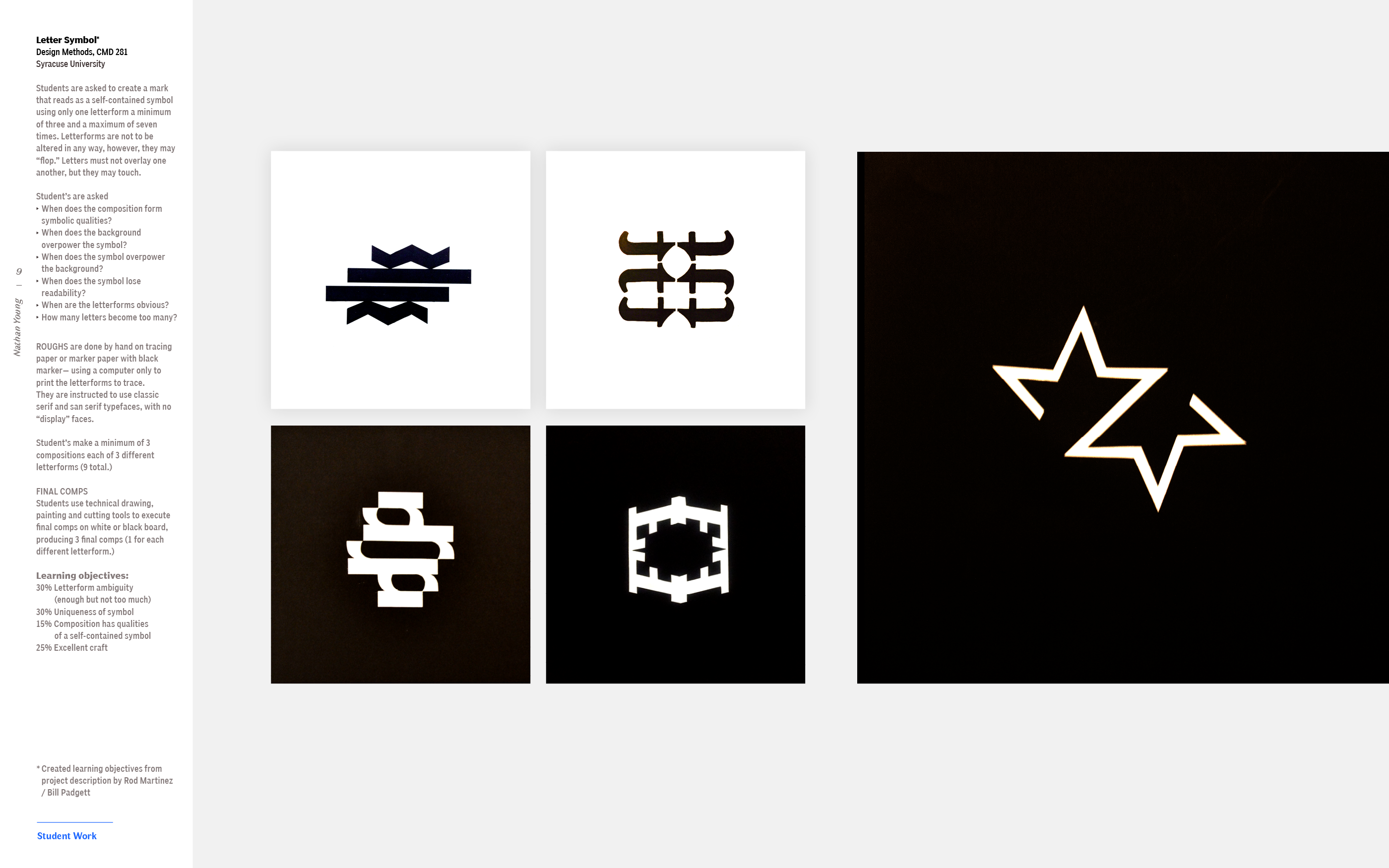
Student groups were assigned an element and a principle of design and they chose one of three emotions— anxiety, exhilaration, inquisitive.
Students were asked to communicate this word in a 3-D volumetric model no larger than 24 x 24 x 24”. Students could use any material they wish so long as the end product was white and executed with the highest possible level of craft.
Visual Objectives:
10% TECHNICAL Is the cube the right size? Is it neatly executed? Is the photo uploaded correctly?
20% CLARITY Does the square clearly communicate and interpret the element, principle, and emotion?
40% CONCEPT
Is there an idea driving the design?
30% DESIGN
Is the design æsthetically pleasing?
Visual Definitions
Design Methods, CMD 281
Syracuse University
![]()
Syracuse University
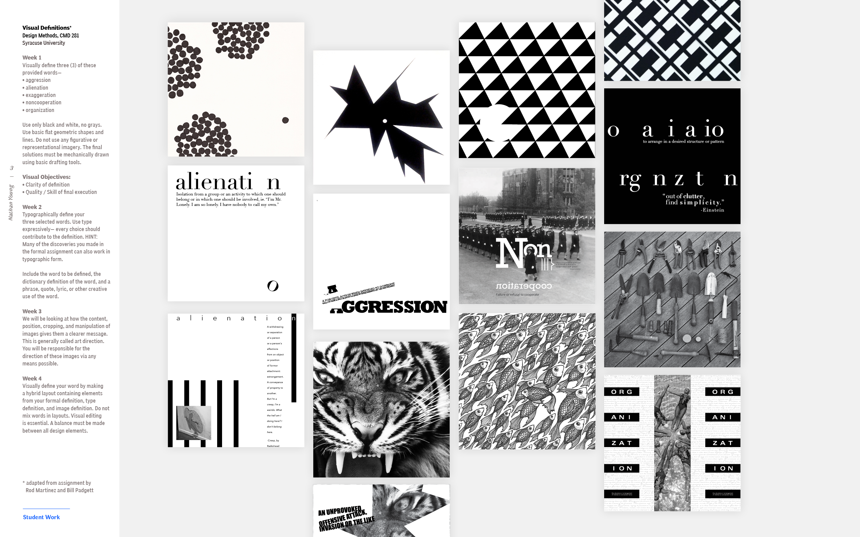
Week 1
Visually define three (3) of these provided words—
Use only black and white, no grays. Use basic flat geometric shapes and lines. Do not use any figurative or
representational imagery. The final solutions must be mechanically drawn using basic drafting tools.
Visual Objectives:
Visually define three (3) of these provided words—
- aggression
-
alienation
-
exaggeration
-
noncooperation
- organization
Use only black and white, no grays. Use basic flat geometric shapes and lines. Do not use any figurative or
representational imagery. The final solutions must be mechanically drawn using basic drafting tools.
Visual Objectives:
- Clarity of definition
- Quality / Skill of final execution
Week 2
Typographically define your three selected words. Use type expressively— every choice should contribute to the definition. HINT: Many of the discoveries you made in the formal assignment can also work in typographic form.
Include the word to be defined, the dictionary definition of the word, and a phrase, quote, lyric, or other creative use of the word.
Include the word to be defined, the dictionary definition of the word, and a phrase, quote, lyric, or other creative use of the word.
Week 3
We will be looking at how the content, position, cropping, and manipulation of images gives them a clearer message.
This is generally called art direction. You will be responsible for the direction of these images via any means possible.
This is generally called art direction. You will be responsible for the direction of these images via any means possible.
Week 4
Visually define your word by making a hybrid layout containing elements from your formal definition, type definition, and image definition.
Do not mix words in layouts. Visual editing is essential. A balance must be made between all design elements.
Do not mix words in layouts. Visual editing is essential. A balance must be made between all design elements.
3-D Definition
Design Methods, CMD 281
Syracuse University
![]()
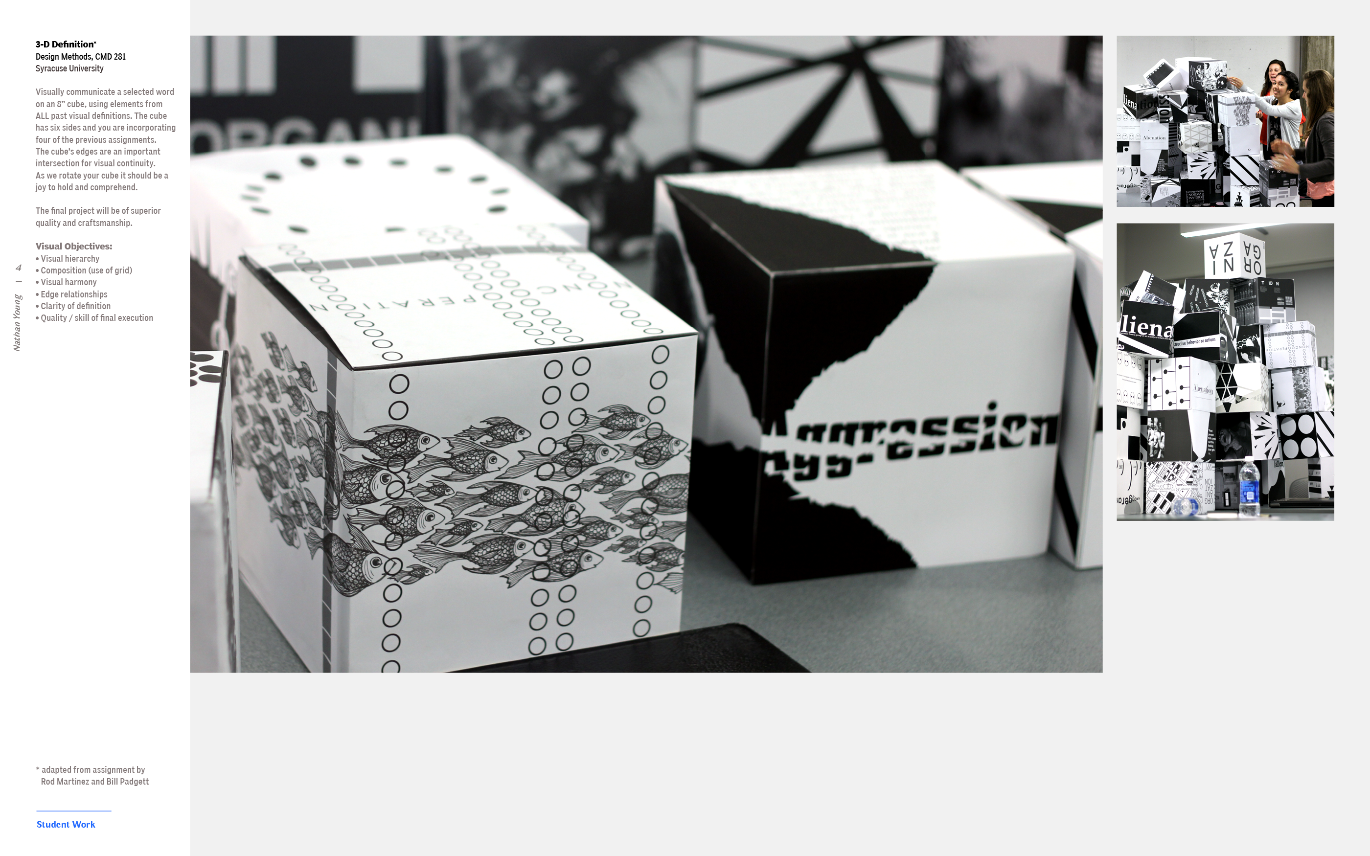
Visually communicate a selected word on an 8” cube, using elements from ALL past visual definitions. The cube has six sides and you are incorporating four of the previous assignments.
The cube’s edges are an important intersection for visual continuity.
As we rotate your cube it should be a joy to hold and comprehend.
The final project will be of superior quality and craftsmanship.
Visual Objectives
The cube’s edges are an important intersection for visual continuity.
As we rotate your cube it should be a joy to hold and comprehend.
The final project will be of superior quality and craftsmanship.
Visual Objectives
- Visual hierarchy
-
Composition (use of grid)
-
Visual harmony
-
Edge relationships
-
Clarity of definition
-
Quality / skill of final execution
Social Justice website
Visual Communications Theory and Practice, GRA 617
Syracuse University
![]()
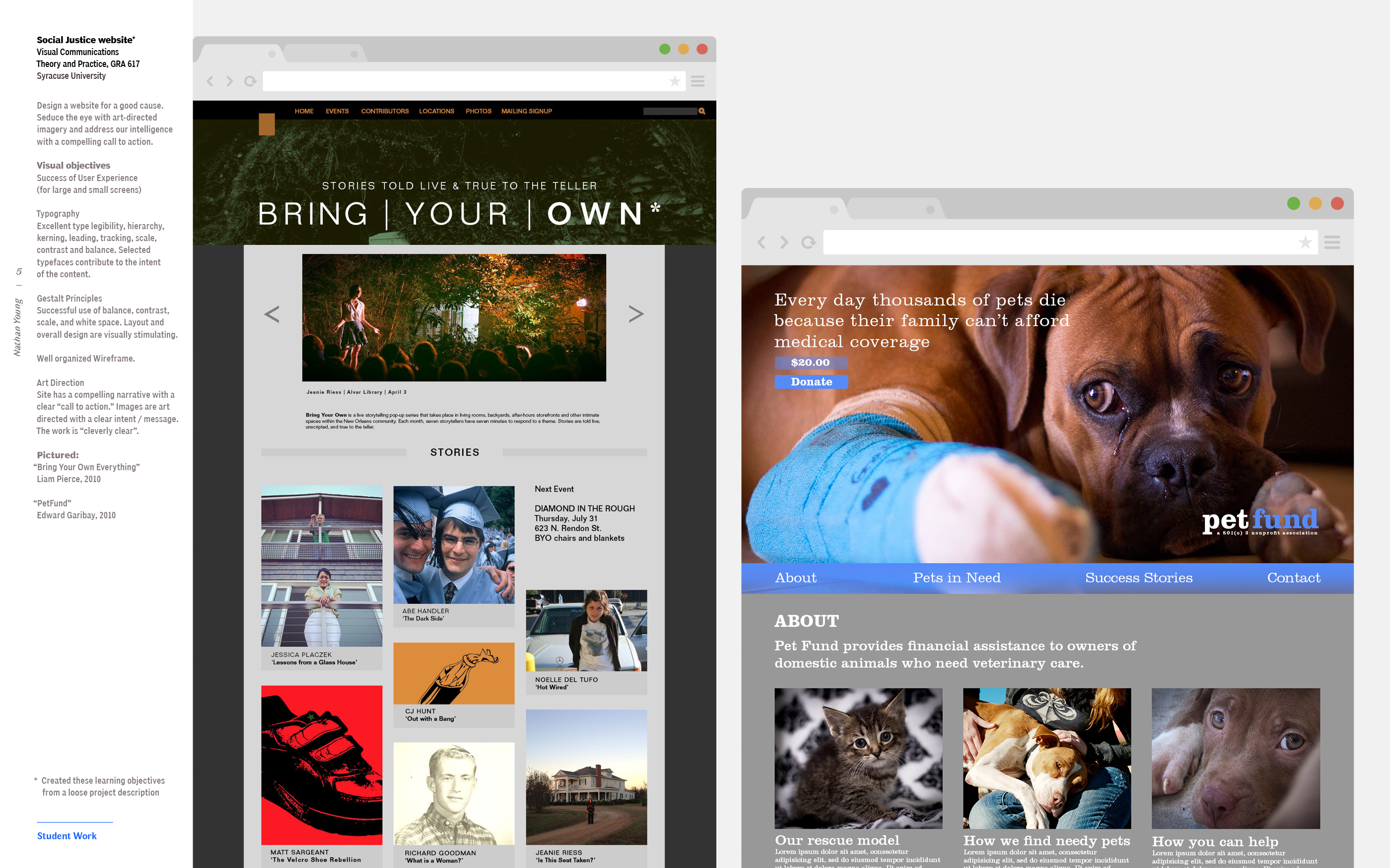
Design a website for a good cause. Seduce the eye with art-directed imagery and address our intelligence with a compelling call to action.
Visual objectives
1— Success of User Experience (for large and small screens)
2— Typography
Excellent type legibility, hierarchy, kerning, leading, tracking, scale, contrast and balance. Selected typefaces contribute to the intent
of the content.
3— Gestalt Principles Successful use of balance, contrast, scale, and white space. Layout and overall design are visually stimulating.
4— Well organized Wireframe
5— Art Direction Site has a compelling narrative with a clear “call to action.” Images are art directed with a clear intent / message. The work is “cleverly clear”.
Pictured:
“Bring Your Own Everything”
Liam Pierce, 2010
“PetFund”
Edward Garibay, 2010
Non-profit poster
Visual Communications Theory and Practice, GRA 617
Syracuse University
![]()

Design a poster for a good cause. Seduce the eye with art-directed imagery and address our intelligence with a compelling visual metaphor.
Visual objectives
1— Concept The concept of the poster is makes a quick, compelling case. The concept is a strong visual metaphor, producing a “smile in the mind.”
2— Image Making Student’s manipulation of imagery is central to the poster. Inventive use of photography, collage, illustration.
3— Typography
Excellent type legibility, hierarchy, kerning, leading, tracking, scale, contrast and balance. Selected typefaces contribute to the intent
of the content.
4— Gestalt Principles Successful use of balance, contrast, scale, and white space. Layout and overall design are visually stimulating.
Student’s create an accordion fold, 24 page book— 8 inches square, black and white only.
Each panel consists of a single, unmodified image. All images are found.
Micro
The transition from page to page should be visually smooth. The flow across the pages should not stop, but should not be predictable or boring.
Macro
Macro themes are communicated from one end of the book to the other. Student’s create themes based on formal qualities, such as the elements and principles of design. Contrasts work very well: Organic to Geometric, Rectilinear to Curvilinear, Point to Line to Plane, Balance to Imbalance, Variety to Harmony, Graphic to Photographic, Dark to Light, etc.
One theme is too easy, overlapping a few makes for a nice challenge.
The final piece should be a joy to hold, to view, and to comprehend.
Pictured:
Elaina Roney
Jacklyn Munck
Connection / Progression
Design Methods, CMD 281
Syracuse University
Graphic Translation
Design Methods, CMD 281, Syracuse University
![]()
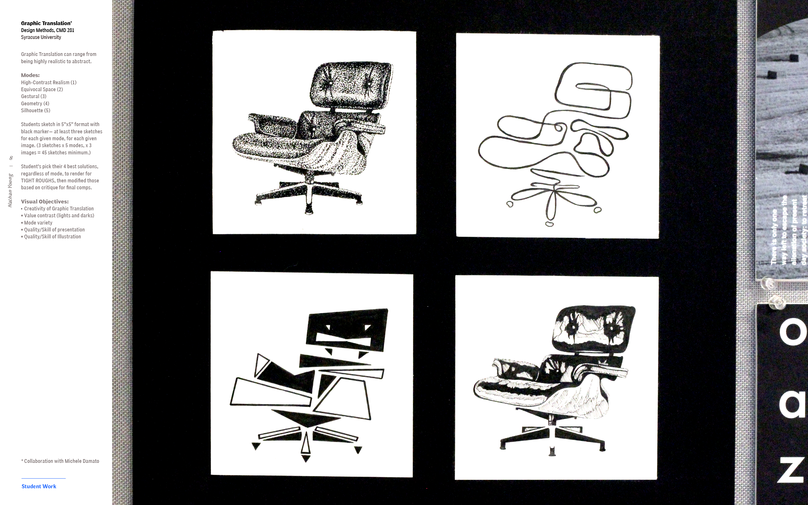
Graphic Translation can range from being highly realistic to abstract.
Modes:
High-Contrast Realism (1) Equivocal Space (2) Gestural (3)
Geometry (4)
Silhouette (5)
Students sketch in 5”x5” format with black marker— at least three sketches for each given mode, for each given image. (3 sketches x 5 modes, x 3 images = 45 sketches minimum.)
Student’s pick their 4 best solutions, regardless of mode, to render for TIGHT ROUGHS, then modified those based on critique for final comps.
Visual Objectives
- Creativity of Graphic Translation
-
Value contrast (lights and darks)
-
Mode variety
-
Quality/Skill of presentation
- Quality/Skill of Illustration


🦶
nathan dot young at temple dot edu